Tutorials
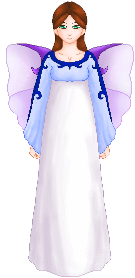
Sometimes, when doing cyberpets, you decide that you want creatures that have a softer shading.. that looks more natural and marshmallowy. It's not something you find very often in cyberpets, at least not in my experience, and it's generally really appreciated and sought after if it's done right.
First of all, this tutorial is just going to show you my general tchnique and how to make shading a little easier for you. It's not really going to be a step by step on how to shade and make things look natural. There is a tutorial on that, however ^_^ Check it out if you feel like you need to. Second of all, this tutorial is made especially for paint programs that have a decent airbrush and lets you use layers. Generally, that would include programs like PaintShopPro, PhotoShop, the Gimp, Painter, and other such programs. If you don't have a program like this, and want one for free, check out my links page ^_^ In case you're wondering, I'm doing this in PantShopPro 6
As always, it's best to start out with an image tht you already have drawn and cleaned up. You could've drawn this in any program, but make sure you have it open in the one with airbrush and use of layers.
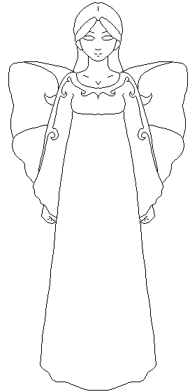
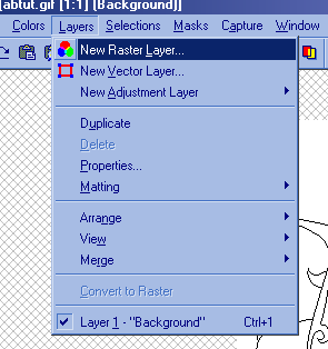
From here (if the picture is saved as .gif or .bmp), make sure you have the amout of colors set to 16 billion, and RGB ^_^ Go to the menu that lets you make a new layer. In PSP6, it's Layers, and then New Raster, but in many programs, it's just Layers and then New. Decide what section of the picture this layer will be for (such as skin, hair, etc) and name it that so you know which layer is which ^_^
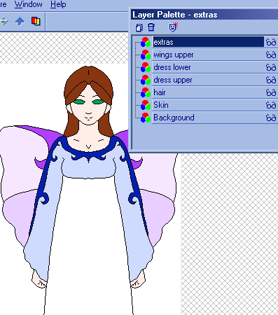
Then just pick a color, and fill in the part of the picture you named the layer after. Make a new layer for ever different color or section of the picture until it's all colored in. Don't start airbrushing or shading anything until you have all the colors in their place. This way, if any of the colors look out of place, you can always go back and change them easily. I have my layer palette open because it makes working with the different layers easier, but you don't have to do this.
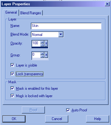
Now, this next step is pretty important. Go back through your layers and "lock" the transparency. In PSP6, it's in Layers > Properties, and there's a little box in the window that pops up. In Photoshop6, it's the first lock option (the checkered box) in the layer window. Check around in your program if you can't find it right away. check the help files if you feel the need to. Just make sure you get that done ^_^ This will make sure that any airbrushing you do out of the ines doesn't show up and mess your picture up.
It's time to airbrush now ^_^ This is simple stuff. First of all, make sure that the color you're going to airbrush on is both your first and your second color choice. This will help you when you're ready to highlight. Click on the color or go into a color selection window, and pick a color a little bit darker than the original. Not too dark, or it won't look smooth when you shade.
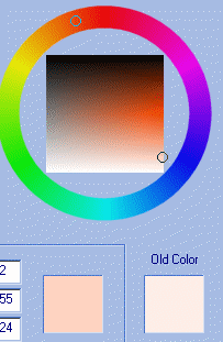
Pick the airbrush tool and set it to a small opacity. I generally choose 4%, 2% when I'm using really small brush sizes, but you can experiment and see what you like. You always start your shading with a color tht's just the smallest bit darker than the base color. This way, it looks smooth and even, instead of blocky and unnatural. It might not look like much right now, but if you keep going, you'll see that this first step always helps out. Remember, if you need help on how to shade, check out the tutorial ^_^
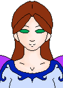
Next, pick a color even darker than the first, and gently go alone the inside of the first color of shading. Never go over it completely (as in, you can't see the first color anymore because you put the second color on top of all of it), because then it wouldn't look quite so smooth. You don't have to put this color everywhere, remember. Just where the shadows on the object are particularly dark.
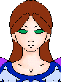
Now, here is where having the second color choice as the base color comes in handy. Switch your colors around so the base color is now your first color choice, and go to the color edit window. Here, pick a color a big lighter than the base color ^_^ This will be your highlighing. Though you can't see the highlighting on this picture too well because the colors are already so light, it's generally very helpful to put that lighter color in. It makes the whole picture look more 3d and round, and a lot more appealing to the eye. Just brush on the light color where ever the light would hit it the most.
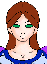
After you're done with the shading and highlighting of an object, feel free to pull out your smudge tool to make it look even more smooth and natural looking. Continue to do this for every layer and section of the picture until you're all finished ^_^ Once you get the hang of this method of shading and coloring, it becomes very easy and is generally done in a fairly small amount of time.
Once you're all done with the picture, you can also make the dark lines more soft and natural looking. Instead of black, you can choose a darker color of the object it's outlining (like I choose a darker purple for the wings and a dark tan for the skin). Usually, this looks best on lighter backgrounds, but it's a nice touch even on dark backgrounds.


This site has been visited